U.S. Births and Unemployment Rate 2007-2012
In this post I’m continuing the theme of sharing my work in the CUNY Master of Science, Data Analytics program. As part of my final project during the Fall 2014 semester, I acquired and analyzed Natality (birth) data from the U.S. Deparment of Health and Human Services (HHS) in combination with Unemployment data from the U.S. Bureau of Labor Statistics to discover possible relationships.
The time frame of the data sets was between 2007 and 2012, which includes the so called “Great Recession”. For me, this seemed like a very interesting data set to see what kind of relationship, if any, would be revealed between birth rate and the state of the economy (using unemployment rate as a proxy).
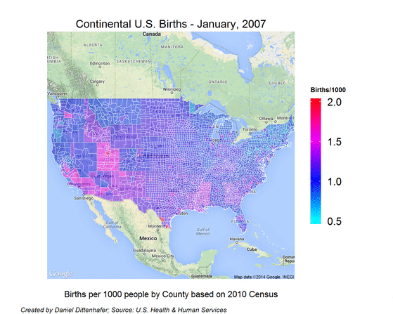
During the process of analyzing the natality data, I created the following geographic heatmap to help me understand the relative changes in birth rate around the United States during the time frame. It presents the birth rate per 1000 people by county throughout the continental United States.
I used R and various R modules including ggplot and ggmap to analyze the data and document my findings. The complete R Markdown code is available on GitHub if you would like to dig in and see the analysis in detail or attempt to reproduce my results. The final paper (in PDF format), U.S. Births and Unemployment Rate 2007-2012, describes the analysis process and initial conclusions as well as a basic model that resulted from the analysis.
The following sample R code shows a little of the “behind the scenes” as to how the geographic heatmap (shown above) was produced. Refer to my GitHub repository for the complete codebase.
1
2
3
4
5
6
7
8
9
10
11
12
13
14
15
16
17
18
19
20
21
22
23
24
25
26
27
28
29
30
31
32
33
34
35
36
37
38
39
40
41
42
43
44
45
46
geoVisual <- function(shapeData, data, title, filename, saveLocation)
{
  # integrate the birth data
  shapeData <- join(shapeData, data, by='id')
  shapeData <- dplyr::mutate(shapeData, BirthsNormalized = BirthsPer1000Pop)

  if(TRUE) {
  # Center the map over the United States
  map <- get_map(location=c(-97.279404, 39.828127), zoom=4)

  gmap <- ggmap(map)
  gmap <- gmap + scale_fill_gradientn(colours=rainbow(50, start=0.5),
                                      limits=c(.5, 2),name="Births/1000",
                                      guide=guide_colourbar(barwidth=0.5))

  gmap <- gmap + geom_polygon(aes(x = long, y = lat, group = group, fill=BirthsNormalized),
                            data = shapeData, #,
                            colour = 'white',
                            alpha = .5,
                            size = .1)
  gmap <- gmap + xlab("Births per 1000 people by County based on 2010 Census")
  gmap <- gmap + ylab("")
  gmap <- gmap + theme(axis.ticks = element_blank(),
                       axis.text = element_blank(),
                       axis.title = element_text(size=8),
                       plot.title = element_text(size=10),
                       legend.title = element_text(size=6))
  gmap <- gmap + ggtitle(title)

  sFooter <- "Created by Daniel Dittenhafer; Source: U.S. Health & Human Services"
  gmapft <- arrangeGrob(gmap,
                        sub=textGrob(sFooter,
                                     x = 0,
                                     hjust = -0.1,
                                     vjust=0.1,
                                     gp = gpar(fontface = "italic", fontsize = 6)))

  plot(gmap)

  if(!is.na(saveLocation)) {
      ggplot2::ggsave(sprintf("%s%s.png", saveLocation, filename),
                      plot=gmapft,
                      width=5, height=4)
    }
  }
}
Links:
Best,